Brand guidelines
Shisa
The SHISA.AI wordmark, our typefaces and the monochrome editorial palette that the company, the website and our decks share.

01
The wordmark
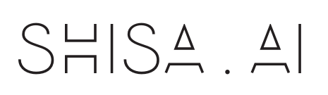
SHISA.AI drawn in a hairline geometric sans, letter-spaced wide, with open triangular As that have no crossbar. It is drawn artwork, not typed text: no font reproduces it, so always use the file. White is for dark grounds and ink is for light grounds.







02
Typography
PP Mori is the house typeface for print and designed material, in two weights: Regular 400 for body and Semibold 700 for headings, set tight at display sizes. It is a licensed face, so it is not in the download; ask us if you are producing material for Shisa. On the web and in everyday documents we set Poppins for Latin text and Noto Sans JP for Japanese, both free from Google Fonts. The specimen below is set in Poppins.
Display
Japan's strongest open LLMs
Body
We train and ship models built for Japanese first, including translation, voice and domain-specific systems, then put them in front of real users through our own products.
Japanese
いろはにほへと ちりぬるを 日本語の見本
| Use | Family | Weight | Tracking |
|---|---|---|---|
| Display | PP Mori · Poppins on the web | 700 · 600 | −0.028em |
| Heading | PP Mori · Poppins on the web | 700 · 600 | −0.02em |
| Body | PP Mori · Poppins on the web | 400 | 0 |
| Japanese | Noto Sans JP | 400 / 700 | 0 |
| Fallback | Helvetica Neue, Arial | — | — |
03
Palette
Monochrome and editorial: ink, graphite and muted on paper, with hairline rules instead of boxes. Orange is the single accent and teal the secondary. Click a swatch to copy it.
04
Usage
Clear space
Keep the height of the S clear on every side. The mark is wide and hairline, and crowding is what makes it disappear.
Minimum size
Hold 160 px wide on screen. Below that the dot between SHISA and AI closes up and the As fill in.
Backgrounds
White on dark grounds, ink on paper, and nothing in between. On mid-greys, on the orange or on a photograph a hairline this thin loses its contrast; put a solid plate behind it.
Large format
The masters are high-resolution PNGs, which cover screen work and most print. For signage, booths and other large-format output, ask us for artwork.
Don't
- Retype the name in a font instead of using the file
- Embolden or outline it to make it survive at small sizes
- Recolour it to the orange or any other colour
- Change the letter-spacing, which is part of the drawing
- Stretch, rotate or add shadows and effects